

When setting goals, regardless of the framework or method that you use, it’s usually a good idea to throw in some sorts of measurements, metrics, and/or indicators that help guide you to your goal and give you insights about whether you’re on the right track to have an impact at the higher flight level or not. Instead of just measuring the impact of the work that you have already done, you also want to think of predictive measures to help influence that result. This is where leading and lagging indicators come in.

Lagging indicators are useful for measuring the success, or lack of, for an event that has already happened. In the example above, it is the number of accidents. Other examples include revenue, customer satisfaction, profit, the number of product/service sales, etc. They are typically easy to identify, measure and compare. However, lagging indicators don’t tell you why something has happened. They also provide insights too late into the process for you to influence the outcome of your event.
Leading indicators are by nature predictive; they tell you what might happen. A leading indicator is a hypothesis of sorts where you predict that by carrying out action X, situation Y will result. From the example above, you’re predicting that if a higher percentage of construction workers wear hard hats, then that will result in a higher safety score for them because they are less likely to cause, and get into, accidents. Leading indicators are hard to come up with because they don’t guarantee the outcome that you’re trying to achieve. They are also not always accurate. For example, a majority of people were happy with their Nokia 3310, but when smart phones came into the market, those same customers made the switch.

Using the H model above, you can see that lagging indicators give you certainty, because you measure the metric after the event has happened, but don’t give you influence on the event itself, since it has already happened. In the bottom half of the model, on the other hand, you trade influence for certainty. While leading indicators can be used to influence events that are about to occur, they are hard to predict accurately – and they give you low certainty.
Both leading and lagging indicators are contextual. An indicator that is considered “leading” in one context can be considered “lagging” in another. In Figure 1 above, the lagging indicator of a very low number of total accidents on a building site, per month, can be a leading indicator for the number of construction workers that you can expect to apply to be a part of the building project. Here, we are making the assumption that construction site safety is considered a benefit/priority among construction worker applicants, the low number of accidents is publicly available for potential applicants, and that the number of accidents on your construction site will remain low.
An indicator or metric can’t be leading or lagging on it’s own; it’s all contextual. Before claiming an indicator to be “leading” or “lagging”, it’s important to ask the people working with the metric, “In which situation are we expecting this to be a leading/lagging indicator?” and “For which behaviors or outcomes that we are trying to drive, do we want to use this leading/lagging indicator?”
Let’s take another example of a delivery service that you own. The lagging indicator, something that you can measure after you deliver the food, can be customer satisfaction. And the leading indicator, something that you predict will influence the customer satisfaction is the time to deliver the food. The blue line in both charts represent the acceptable limit – in Figure 2, above it is not acceptable for clients, and in Figure 3, below it is not acceptable for your delivery company.
There is often a delay between the leading and lagging indicators, hence the nomenclature. In Figure 2, we can see that the time to deliver food crossed above the acceptable threshold in week 6. The customers start being dissatisfied from week 6, but they don’t reflect on your net promoter score (NPS) survey until week 9. But as a delivery service owner, if you are looking only at the lagging indicator of customer satisfaction (Figure 3), then the customer satisfaction scores during week 6-8 look quite good! If we are using only the lagging indicator of customer satisfaction (Figure 3), then we don’t find out at the customers are unhappy until week 9, by when it may be too late to win the customers back. If you had used Figure 2, you would have seen that the average time to deliver food has been on the rise constantly – an indicator for you to find out why that is happening and prevent the trend from continuing.
This is an example of how using leading and lagging indicators together can help you predict and shape the outcomes that you want to drive.
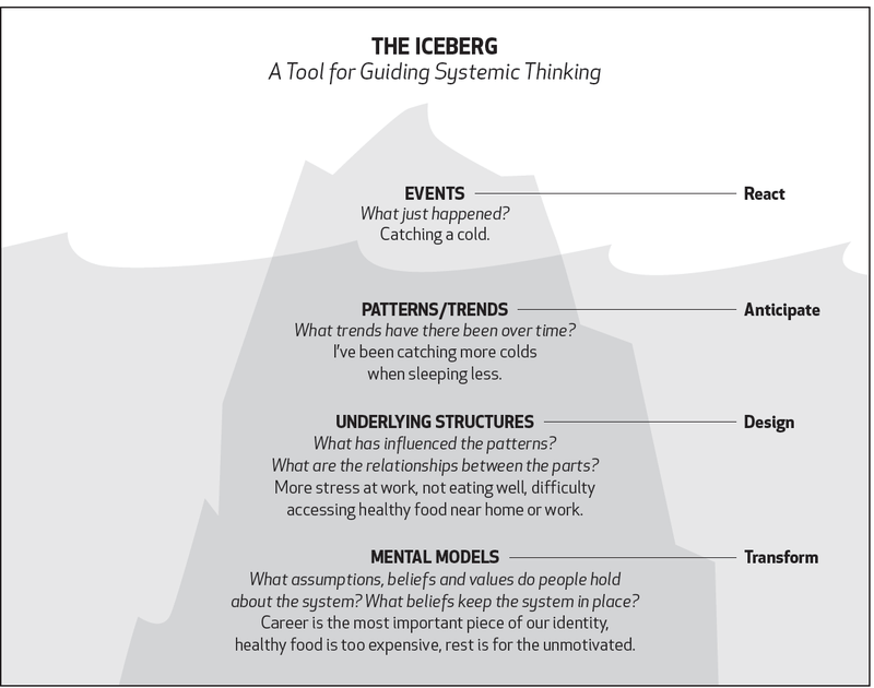
But how do you use your lagging indicators as drivers to derive accurate leading indicators from them, for the same context, or event? Let’s look at something called the Iceberg Model for systems thinking, which helps you understand why specific events take place and the patterns, underlying structures, and mental models that influence them.
Using the same structure, in the examples from figures 2 and 3 above, let’s start with the lagging indicator of customer satisfaction (NPS). In our case, this is easy to measure – after each food delivery is complete, the customer completes the net promoter score survey about how satisfied they were on a scale of 0-10 with the delivery of the food.

To come up with a leading indicator, think about what can influence your customer satisfaction. What patterns or trends have you noticed in the past that indicate how happy your customers are? One possible leading indicator would be the average time to deliver food.

In the image above, I call the average time to delivery food a first degree leading indicator because we predict that it directly impacts the lagging indicator of customer satisfaction. Now as the business owner, you want to decrease the time to deliver food – but in which context? And how can you do that? This is where second and third degree leading indicators come in.
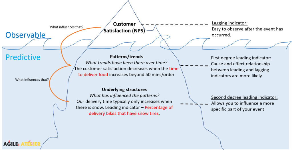
In the underlying structures segment, we see from our past data that our delivery time typically only increases when there is snow. The second degree leading indicator example of percentage of delivery bikes that have snow tires gives more specificity to the first degree leading indicator of time to deliver food. Keep in mind that there can be other first, second, and third degree leading indicators for each lagging indicator. It’s sometimes a good idea to adopt a design-thinking approach to use something like the double-diamond format for coming up with divergent thoughts then converging and selecting the ones that make the most sense.
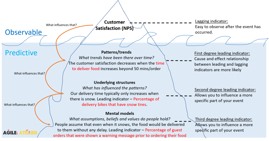
At the mental models level, you can try to think about what assumptions are made for food delivery when it snows. One solution could be to show all potential guests a small warning message, prior to order their food, that says “Due to snowfall in the city, please except a delay of x minutes.” You’re anticipating that by being transparent about potential delays, customers will then have a more accurate expectation of the time to deliver food, which will in turn increase customer satisfaction.
You can go down the different layers of the iceberg – from the lagging to the third degree leading indicators, by asking the question “What influences that?”. This is represented by the orange arrows on the left of the image.

The modified H model shows that while each subsequent degree of leading indicators provides higher influence into specific parts of the event, they also come with lower certainty and causation between your actions and the desired results. For example, there is a lower likelihood that by showing the warning message when it snows (third degree leading indicator) that customer satisfaction would increase. Au contraire, there is a higher likelihood that the customer satisfaction would increase if the time to deliver food (first degree leading indicator) decreased. However, the first degree indicator in this case doesn’t provide much specificity into how you could do that. Similar to other cascading systems, the lagging indicator is influenced by the first degree leading indicator, which is influenced by the second degree leading indicator, which is influenced by the third degree leading indicator.
Essentially, a first degree leading indicator can be considered a lagging indicator for the second degree leading indicator. And a second degree leading indicator can be considered a lagging indicator for the third degree leading indicator, and so on. However, I find that keeping the terminology as it is, is important if you have a key lagging indicator such as customer satisfaction (NPS) that you want to track across the different layers depending on the certainty and influence that you would like.
Ultimately, you want to leverage the concepts from the H model of indicators and the Iceberg model of indicators to deploy a combination of leading and lagging indicators across different degrees, or layers, to both understand and predict the (end) user impact you have had and predict to have. This allows you to go from reacting to a specific event to anticipating and designing a response to it by understanding the patterns, underlying structures, and assumptions.

8 thoughts on “Icebergs and KPIs”